“The Art of Letterpress” showcases the beauty of print
on February 23, 2012
The silhouettes of hundreds of Occupy Oakland protesters are encased in the belly of an angry matryoshka doll. The outline of the Russian figurine is printed with burnt-red oil ink on beige cardboard. Above and below the strange depiction reads the text “Oakland Onward” written in cyan and gray bold sans-serif font.
Dozens of matryoska posters appeared on the trees of Canyon—a small community located between Oakland and Moraga—one morning in November 2011. A few hours later, most of them were gone. “We thought the neighbors were angry at the message,” says Jeanne Lorenz, the fine art and letterpress printer who had made the posters, “but it turned out they liked it too much. They asked us to print more copies.”
Lorenz, 43, says her eight-year-old daughter came up with the idea after joining the Occupy Oakland protests with her father last year. “She wanted to do something in Canyon,” Lorenz says. “But it’s hard to do an Occupy camp in a town of 200 people.” Instead, mother and daughter designed the posters inspired by drawings of Russian dolls the girl had sketched earlier. The images were printed on beige cardboard on Lorenz’s old manual press. Each poster depicts a doll with a distinctive picture on her belly accompanied with a message, such as “Occupy Past,” “Occupy Future,” “Occupy Canyon” and “Oakland Onward.”
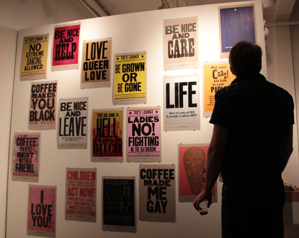
The seven posters that once praised the 99% on the woodland roads of Canyon are now part of the newest exhibit at The Compound Gallery in Oakland. The exhibit, “The Art of Letterpress,” showcases the work of more than 15 print artists from the Bay Area and other letterpress meccas in the U.S. These new wave of printers combine up-to-date design software and materials with printing techniques as old as the Gutenberg press. “Those who say letterpress is dying don’t live in the Bay Area,” says exhibit co-curator Rebecca Peters. “People who live here are drawn to the tactile element and the quality of letterpress work that other forms of print don’t have.”
The exhibit, which opened on February 11, 2012, features a variegated collection of printed art, from vintage banners of bluegrass music festivals and illustrations of fairy tales to portraits of Bruce Lee and posters of gay rights protests. The Art of Letterpress also includes displays of materials and tools used in traditional printing.
Peters, 34, an etchings and print artist and San Francisco Art Institute alumna, bought a 1925 Chandler & Price platen press—her first letterpress—in 2009, not only to expand her artwork, but also to make ends meet. “I bought it during the economic downfall,” she says. “I wanted to print for other people as way to support myself.” That year, Peters started her own business, Reb Peters Press in West Oakland, where she creates customized business cards, wedding invitations, postcards and posters. She works on her own art in between orders.
Letterpress artists transform text into displayable art, Peters says. Poetry broadsides are examples of this literary visual mix. “Poems are tucked away and you only see them when you open a book,” she says. “It’s really great to have a poem that really means a lot to you have it on your wall where it’s easily accessible.”
Peters has printed broadsides of some of her poems. One of them, displayed at the exhibition, is entitled “Lies and Fries.” The first verse reads:
Linus likes legumes like Lucy likes linguini
Ernesto eats edamame till Ed puts on his bikini
The blue small rounded letters pressed on a thick white paper create a 3-D effect on the seven stanzas, placed unevenly (but with calculated spacing) throughout the sheet. The poem is illustrated by the outline of an electric pink sailboat floating on sea waves formed with curved tracings in shades of green and blue.
Peters uses the “Lies and Fries” broadside to exemplify her process of letterpress printing. She designed the poem layout using Abode Illustrator. Then she had the layout printed on a photo polymer plate, a plastic surface on which the text is in relief. The sailboat and the waves were also printed on a polymer plate. Peters says drawings can also be carved on linoleum blocks. The artist must carve the white spaces—or the un-inked parts—of the illustration. “In letterpress you have to think backwards and in reverse a little bit,” she says while holding a linoleum block in which she drew the cartoon of a big-headed boy.
Once the plates are ready, they are placed on the press, tightened by chase blocks, a wooden frame that keeps the plates from moving during the printing. The paper must go through several printing sessions, one for each color. The ink is placed on a circular metallic plate and then it’s “grabbed” by two rollers attached to the bottom of the press. The rollers ink the relief surfaces of the plate. Once inked, the plates are pressed onto the paper sheets one by one with a handle-pedal mechanism.
Peters says the process, from designing to cutting out the paper, requires time and precision. “A lot of printers are very fussy so they usually take a lot of time do this,” she says. “I’m not as bad as some of them, but it’s very important to make sure all the elements fit.” She says great quality is usually the result of fussiness. “When you do this, you come to appreciate other people’s work and the care they’ve taken doing it. I have a lot of respect for good printers.”
Letterpress printing is not a new to the Bay Area. Printers Adrian Wilson and Jack Stauffacher made San Francisco—their hometown—one of the epicenters of innovative and state of the art book and letterpress printing since the post-WWII era. Wilson and Stauffacher’s work is praised among national and international artists and print connoisseurs. They are also known for leading the way for a group of printers who continued the tradition of letterpress in the San Francisco Bay Area.
Peters says The Art of Letterpress presents the work of a new wave of letterpress artists, who might not share the same ideas as their predecessors. “Some of the older printers don’t see letterpress as a way to make art,” she says. “There are definitely those who do, but most of them are just more traditional.” Peters says the old and new wave of printers clash on their ideas on the use of technology, especially the use of software to design layouts. “Some of them frown upon even having a plate made,” she says. “They want everything hand set.”
Although Peters uses both digital prints and traditional type, she says using new technology is necessary to run her business. “I like the romanticism of hand-setting the type, but it doesn’t really make sense from the economy stand point,” she says. “It takes 20 times more to set everything by hand. My time is valuable to me.”
Despite this debate, Peters says new and old printers have one thing in common. “Nobody is getting rich from letterpress printing,” she says. “People who do this, for business or for art, do it because they love it.”
Claire Kessler-Bradner, 31, an Oakland print artist and an art teacher at the San Francisco Sacred Heart Cathedral Preparatory, fell in love with letterpress as a child. Her mother ran a printing studio in her home in San Francisco. “The print shop was also my house. The art space and my domestic space were overlapped and that had a great influence in my upbringing,” she says. Kessler-Bradner says she enjoys the “hands-on experience” of letterpress over other forms of art, but that’s not the only reason printing became her favorite activity. “Even working on your own thing, there’s a sense of comradely in letterpress printing,” she says. “Everybody works, creates and solve technical problems together.”
Kessler-Bradner describes her experience growing up among printers in her poem “Ode to Printmaking,” which she printed on a sand-colored paper with a Vandercook letterpress. The broadside is displayed on the exhibit. The Oakland artist says letterpress printing is becoming increasingly popular in the Bay Area. “People crave letterpress because it’s something they can touch and feel,” she says. “I think always a return to what’s more tactile and handmade because our culture is so focused on what we see on a screen.”
Not all the artists showcased in the exhibit come from the Bay Area. One of the highlights of the exhibit is a collection of posters by Alabama printer Amos Paul Kennedy Jr. Kennedy is known among letterpress lovers for his use of bold and large fonts, bright colors and provocative messages, like “You are going to hell and the devil is my bitch.” The phrase is printed in glossy black ink on a natural cardboard with strokes of bright red, orange and fluorescent yellow on the background. Below this poster another reads, “Life,” in a big bold font. Right below these word a message was printed on tiny rounded typography: “You’re not gonna get rich, so you might as well be happy.”
Kennedy is the subject of the 2008 documentary “Proceed and be Bold!” (a message on of his posters) directed by Chicago filmmaker Laura Zinger. The film describes his transition from a corporate man to a “humble negro printer,” as he describes himself in the documentary, who uses letterpress as a means to convey his thought on gender, racial and social issues.
Some of Kennedy’s posters, as well as work from other artists in the exhibit, are available for sale. Prints for sale also include mini posters, postcards and gift cards created by Bay Area print artists. As part of the exhibit, Peters will have a letterpress workshop at the gallery on March 18, 2012, using the gallery’s Chandler and Price platen press, also displayed in the exhibit. The workshop is limited to seven people. Peters also offers workshops at her studio in the American Steel Warehouse in West Oakland. “Couples come and print their own weeding invitations. It’s kind of fun,” Peters says. “People really like to work on their own projects. It’s really exciting.”
The Art of Letterpress will run through March 25, 2012.
3 Comments
Oakland North welcomes comments from our readers, but we ask users to keep all discussion civil and on-topic. Comments post automatically without review from our staff, but we reserve the right to delete material that is libelous, a personal attack, or spam. We request that commenters consistently use the same login name. Comments from the same user posted under multiple aliases may be deleted. Oakland North assumes no liability for comments posted to the site and no endorsement is implied; commenters are solely responsible for their own content.

Oakland North
Oakland North is an online news service produced by students at the UC Berkeley Graduate School of Journalism and covering Oakland, California. Our goals are to improve local coverage, innovate with digital media, and listen to you–about the issues that concern you and the reporting you’d like to see in your community. Please send news tips to: oaklandnorthstaff@gmail.com.


I want to thank Monica Cruz Rosas for an excellent story about the letterpress show at the Compound.
It was nice to meet you at the opening. All the Best, Jeanne Lorenz
[…] Featuring work by: Lisa Berman, Matt Chase, Tim Fite, Rachel Foster, Vanessa Huang, Jemmy Joe, Claire Kessler-Bradner, Bryan Kring, Mary Laird, Studio Lorzig, Amos Paul Kennedy Jr., Rebecca Peters, Lisa Rappoport, Two Fine Chaps and more. Show runs through March 25. More info here. Read Oakland North’s previous coverage here. […]
[…] Featuring work by: Lisa Berman, Matt Chase, Tim Fite, Rachel Foster, Vanessa Huang, Jemmy Joe, Claire Kessler-Bradner, Bryan Kring, Mary Laird, Studio Lorzig, Amos Paul Kennedy Jr., Rebecca Peters, Lisa Rappoport, Two Fine Chaps and more. Show runs through March 25. More info here. Read Oakland North’s previous coverage here. […]